
Role: UX/UI Designer.
Streamie is an app that enables high-quality streaming from multiple cameras and is available on iOS, iPadOS, Mac, and Apple TV. As a primary user of the Apple TV app, I use it regularly when setting up camera streams on Apple TVs for clients to whom I provide IT services. I believe the app could benefit from a more streamlined user experience and interface. This redesign and feedback were presented to the app’s creator, Curtis Jones, to address bugs and enhance the overall interface.
Watch a Quick Overview of the Streamie App Redesign
Loading Screen
Current
The current loading screen displays backend processes, which are not directly relevant to the user. This information may overwhelm or confuse users, as it reveals internal app operations that are not actionable or meaningful to them.

Suggested
Instead, we could focus on creating a cleaner and more engaging experience by showing a simple, branded loading screen with the app logo or a visual cue indicating progress. This approach helps maintain a professional appearance and ensures the user feels the app is responsive and streamlined, even during loading.
What's New Screen
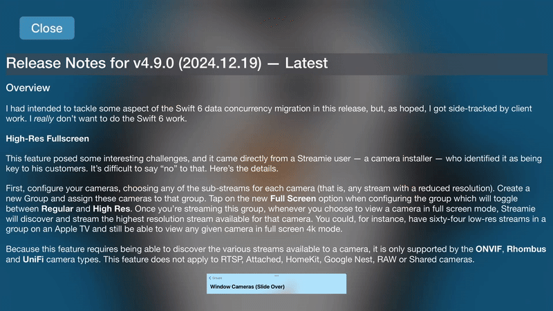
Current
After the loading screen, the app currently displays release notes in a full-screen format. While it’s great that there’s a persistent close button, ensuring users can easily exit this view, the full-screen layout can still feel intrusive and might not provide the best experience for consuming this information.
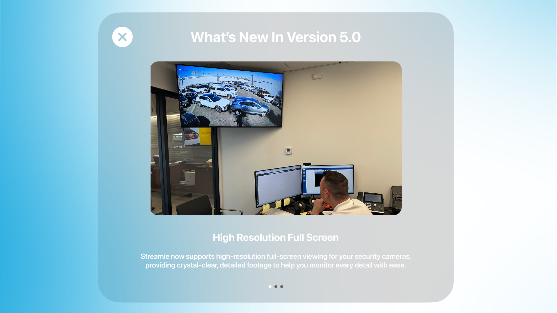
Suggested
An alternative would be to present the release notes in a modal format, which users are more familiar with and intuitively understand as a temporary overlay. This would make it clearer that the main interface is just one step away. To further improve the release notes experience:
1. Carousel Design: Instead of a long scrollable list, consider breaking updates into a carousel. Each slide could highlight a single update with a brief description and a visual (like screenshots or icons).
2. Simplified Presentation: Focus on the most important updates, summarizing them effectively while offering a link to detailed notes if needed.
3. Reinforce the Close Button: The persistent close button is already a strong feature, it ensures users always have an easy way to exit. Retaining this functionality in the modal would be ideal. This redesign would create a more user-friendly, visually appealing way to share updates without disrupting the user’s flow.
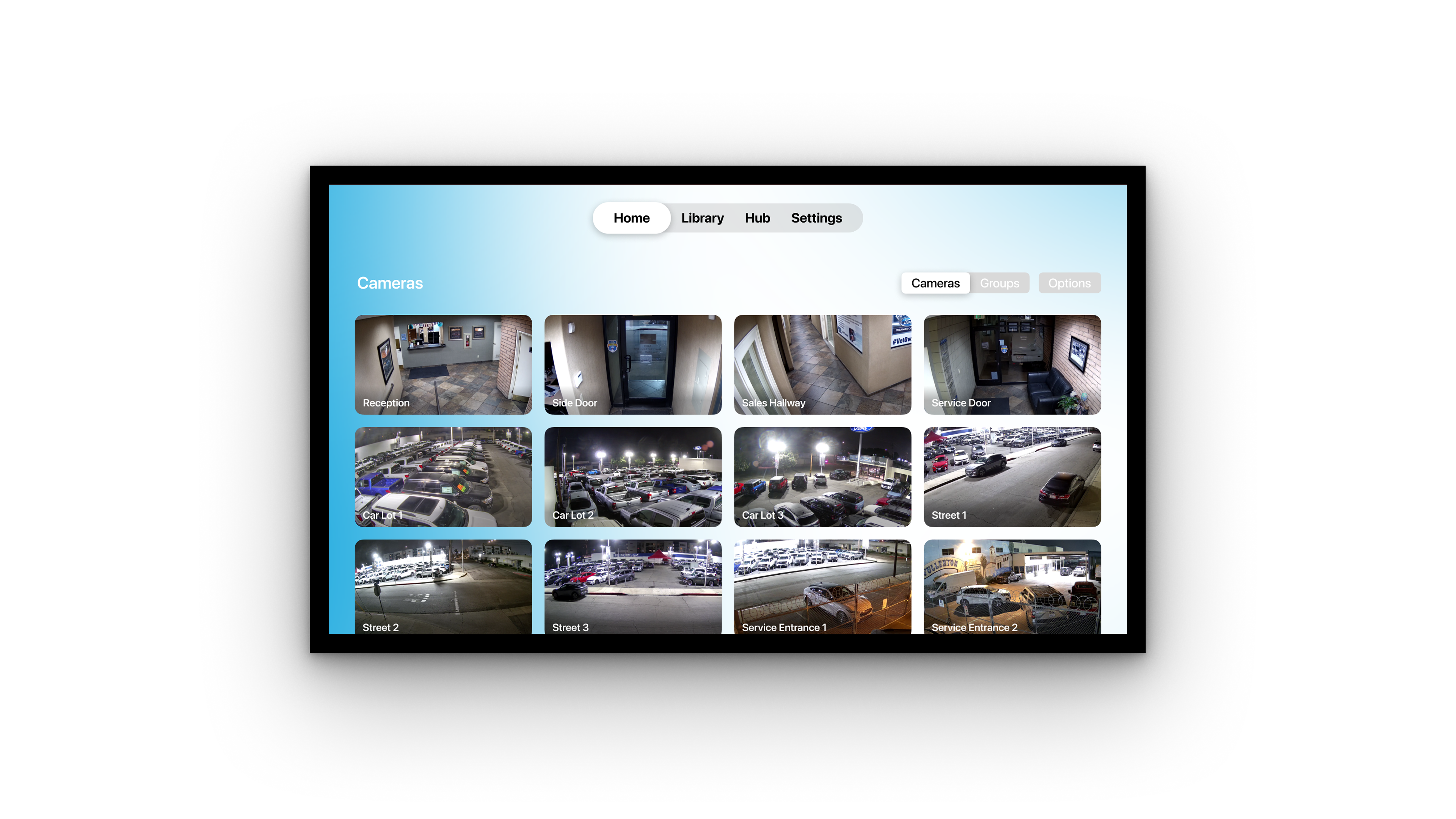
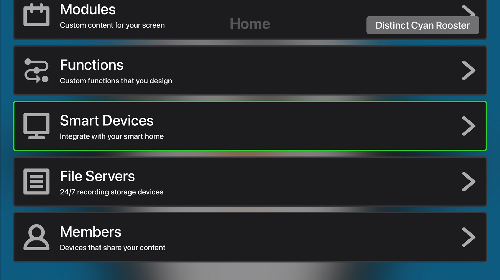
Home
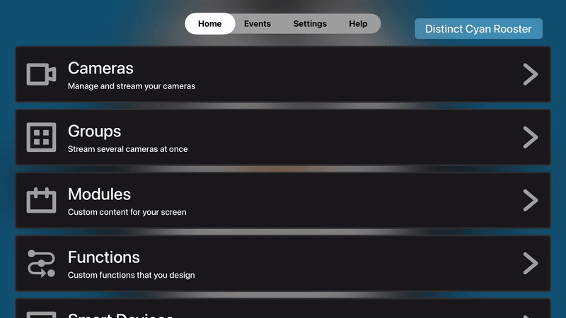
Current
The current Home tab provides a menu that combines features and settings. As the first point of entry into the app, this setup makes it harder for users to quickly access the main purpose of the app—viewing security cameras. Some of these menu items could be better organized and moved to the Settings tab to improve navigation.
Suggested
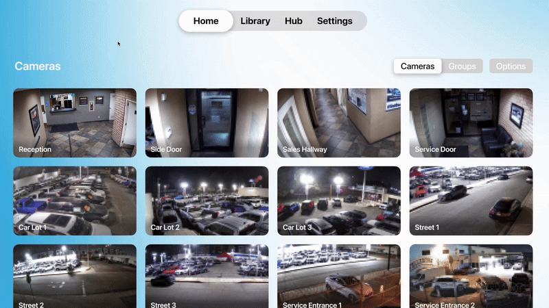
The Home tab can serve as a dedicated space for viewing current cameras, groups, and even modules. The mockup illustrates an account with existing cameras, but new users could be simply redirected to the options button to manually add their cameras.
Library
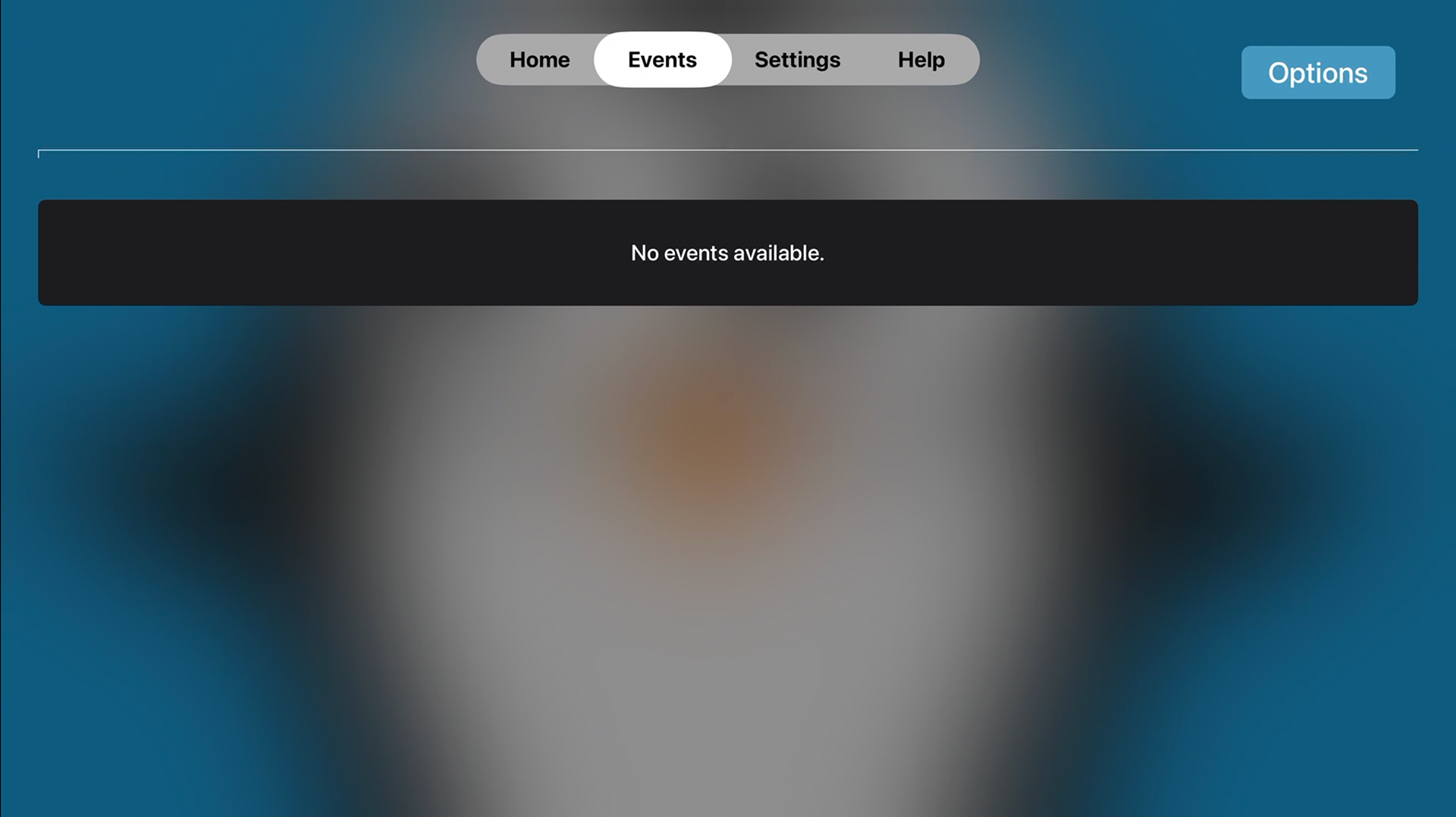
Current
The Events tab is straightforward, displaying recent events captured by the user’s cameras. Its inclusion in the navigation is relevant for the user.
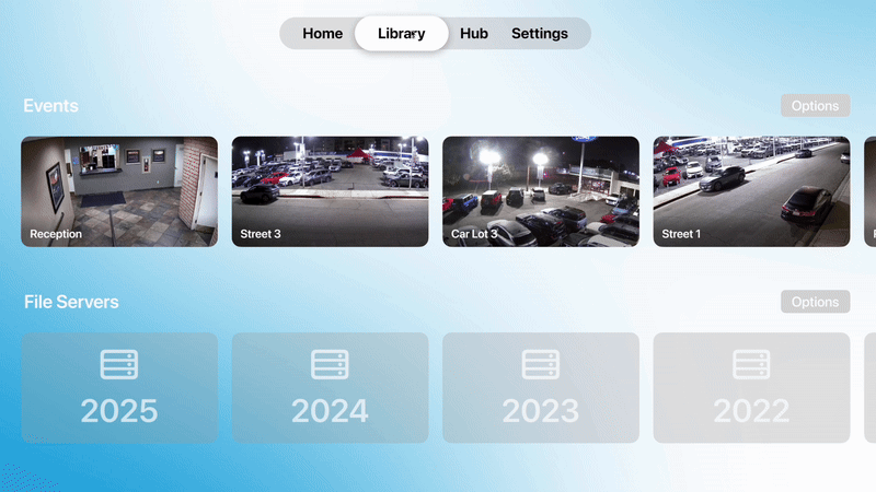
Suggested
I suggest renaming the Events tab to “Library,” a tab that will include both events and file servers. This will help move file servers out of the current Home menu and place them where they logically belong. The Library tab will serve as the central location for reviewing all stored footage, whether from captured events or from file servers.
Hub
Current
Smart Devices is a feature on Streamie that allows users to control smart home devices, but it is currently buried under the Home menu.
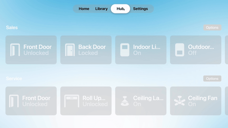
Suggested
Given the importance of the Smart Devices feature, I believe it should be included in the main navigation menu for easier access. Renaming it to something like “Hub” would maintain the simplicity of the menu while making it clear to the user that this is the central place to control all smart devices.
Settings
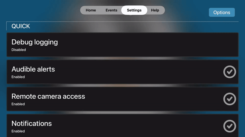
Current
There are two additional tabs in the menu: Settings and Help. The Settings tab contains numerous options that perform similar functions and could be condensed, as it is currently disorganized, requiring users to jump through a long list. The Help tab, which only includes general information about the app and support links, doesn’t seem prominent enough to justify its own tab.
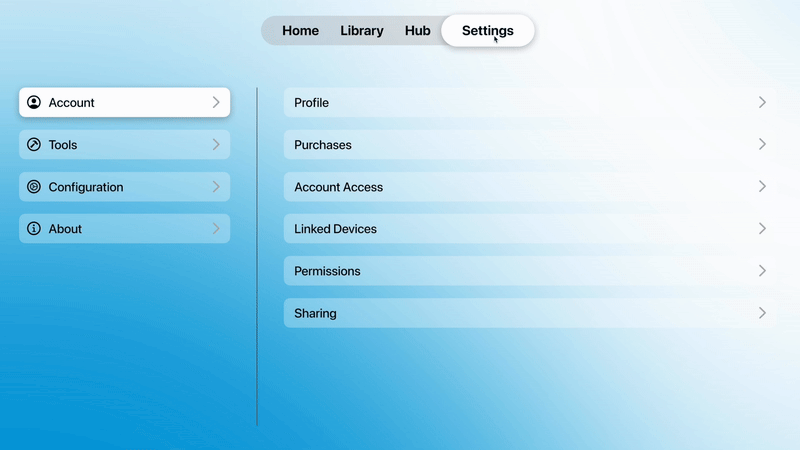
Suggested
Settings and Help could be condensed into a single tab called “Settings.” All the settings and information from both tabs can be organized into four categories: Account, Tools, Configuration, and About. These categories would be displayed in the first column, with the settings for each appearing in the second column, and customization options in the third column. This three-column panel navigation would simplify the UI and improve overall usability.
Meeting with Curtis Jones
I presented my feedback and UI designs to Curtis Jones, the creator of Streamie, along with some of the UX issues I identified in the current app. He acknowledged being aware of some of these issues and pointed out additional bugs. He liked several of the ideas I presented, and we discussed potential new features for the app and its future evolution. It was a great conversation, and I truly admire the work he’s put into Streamie. I offered to collaborate with him if he ever needed assistance, and later, he emailed me to share that he was addressing some of the UX issues I mentioned. He also sent me an invite to join the testing of an unreleased version of the Streamie app via TestFlight. I can’t wait to see how Streamie continues to improve for other users like me.
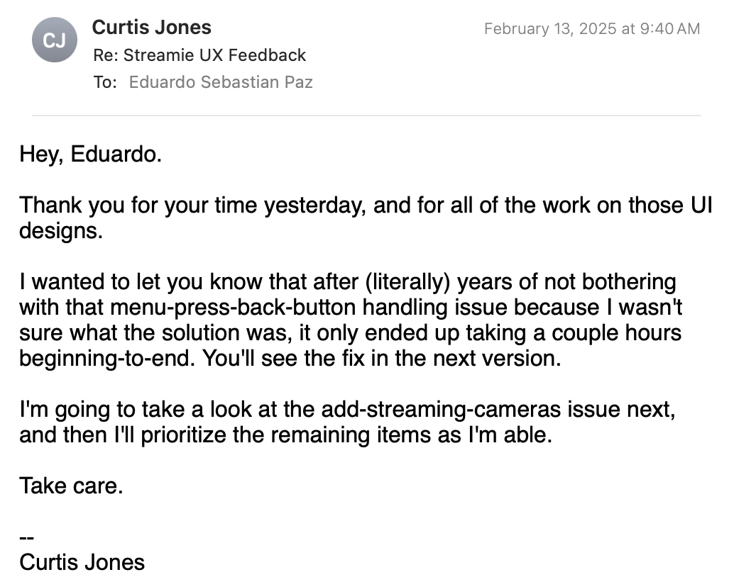
Email from Curtis Jones, creator of Streamie
Watch a Detailed Walkthrough of the Streamie App Redesign
Explore Figma Prototype